The Return of Color: The Fashion Shift Everyone Will Be Wearing
After a decade of beige restraint, colour has returned to the luxury wardrobe — softer, smarter and entirely unshouty. A guide to wearing baby pink, butter yellow, chocolate brown, soft blue, sage and burgundy the way Italian women do.
By Marguerite Lane · August 3, 2026 · 13 min read
For the better part of a decade, the most persuasive argument in fashion was subtraction. Beige, greige, camel, oatmeal, ivory, black. The uniform of quiet luxury was written in a whisper, and the women who wore it best — the Toteme women, the Row women, the Loro Piana women — made a virtue of saying almost nothing at all.
Something has shifted. Walk down Via della Spiga in June, or through the courtyard of a hotel in the Sixth on a Thursday evening, and the wardrobe you see is unmistakably in colour. Not the frantic, dopamine-dressing colour of 2022, which felt like a reaction to something. This is slower and more assured: a butter yellow silk shirt with cream trousers. A baby pink poplin dress under a chocolate brown coat. Sage green linen at eleven in the morning, burgundy silk at nine at night.
The distinction matters. Colour is not the opposite of elegance — saturation is. What the luxury houses have quietly discovered is that a wardrobe can be full of colour and still read as restrained, provided the tones are muted, the fabrics are serious and the silhouettes stay clean. It is the same discipline as minimalism, applied to a wider palette.
What follows is a considered guide to the six colours that define this moment, the return of the printed trouser as the season's true statement piece, the fabrics that make colour look expensive rather than cheap, and the small editorial principles that let a woman build a palette she will still be wearing in ten years.
Why Colour Came Back — and Why It Looks Different Now
Minimalism did not fail. It simply finished its argument. Once a generation of women had learned to buy fewer, better things — the perfect coat, the perfect trouser, the perfect white shirt — the interesting question was no longer how little can I wear, but what do I want to say. Colour is the natural next sentence.
The houses noticed first. Max Mara sent butter yellow down a runway that had been camel for thirty years. Ferragamo rebuilt an entire identity around a single, specific red. Khaite began cutting its sharp, slightly severe tailoring in soft blue and dusty pink. Toteme, the patron saint of restraint, introduced chocolate brown as a neutral in its own right — which, by 2026, it very much is.
What unites these gestures is the refusal of brightness. These are colours with grey or brown mixed in, colours that behave like neutrals in a wardrobe: they combine easily, they photograph softly, they flatter skin rather than competing with it. A woman in a well-cut butter yellow blazer does not look like she is wearing yellow. She looks like she is wearing light.
The other change is structural. Colour used to arrive in the wardrobe through accessories — a bright bag, a scarf, a shoe. It now arrives through the biggest pieces: the coat, the suit, the trouser, the dress. That is a far more confident position, and it is why this feels like a permanent shift rather than a season.
Baby Pink: The New Neutral
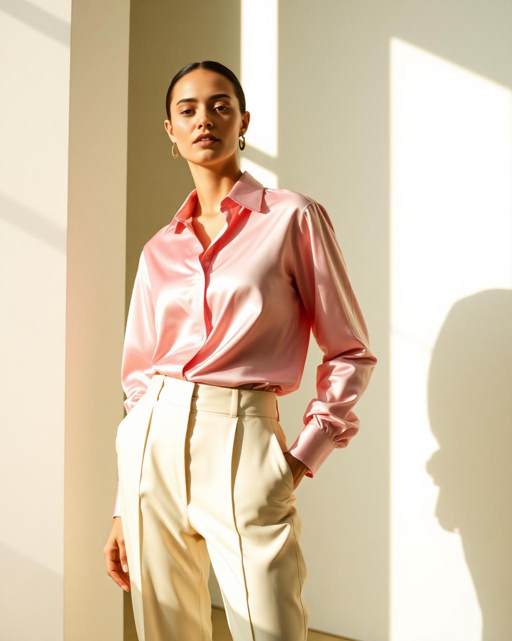
Baby pink has spent years being misunderstood as girlish. Worn properly — in a heavy silk, a crisp cotton poplin, a fine wool — it is one of the most sophisticated colours in the modern wardrobe, and by some distance the most flattering. It warms the face the way candlelight does.
The rule is simple: keep the shape severe. A baby pink outfit becomes sweet only when the silhouette is also sweet. Pair a pale pink shirt with sharply pleated cream trousers, or a pink poplin shirtdress with flat leather sandals and no jewellery beyond a single gold chain. Miu Miu understands this; so does Khaite, which cuts pink into shapes that are almost architectural.
For combinations, pink asks for warmth rather than contrast. Cream, ivory, camel, chocolate brown, cognac leather. It is remarkable with brown — the pairing of pale pink and dark chocolate is, to my eye, the single most elegant colour proposition of the year. Avoid black, which drains it, and avoid grey, which makes it look like a hospital corridor.
Editor's tip: if you buy one baby pink piece, make it a baby pink shirt in a substantial silk. It works under a navy blazer, over white denim, tucked into chocolate trousers, and beneath a camel coat in October.
Butter Yellow: The Colour of Good Light
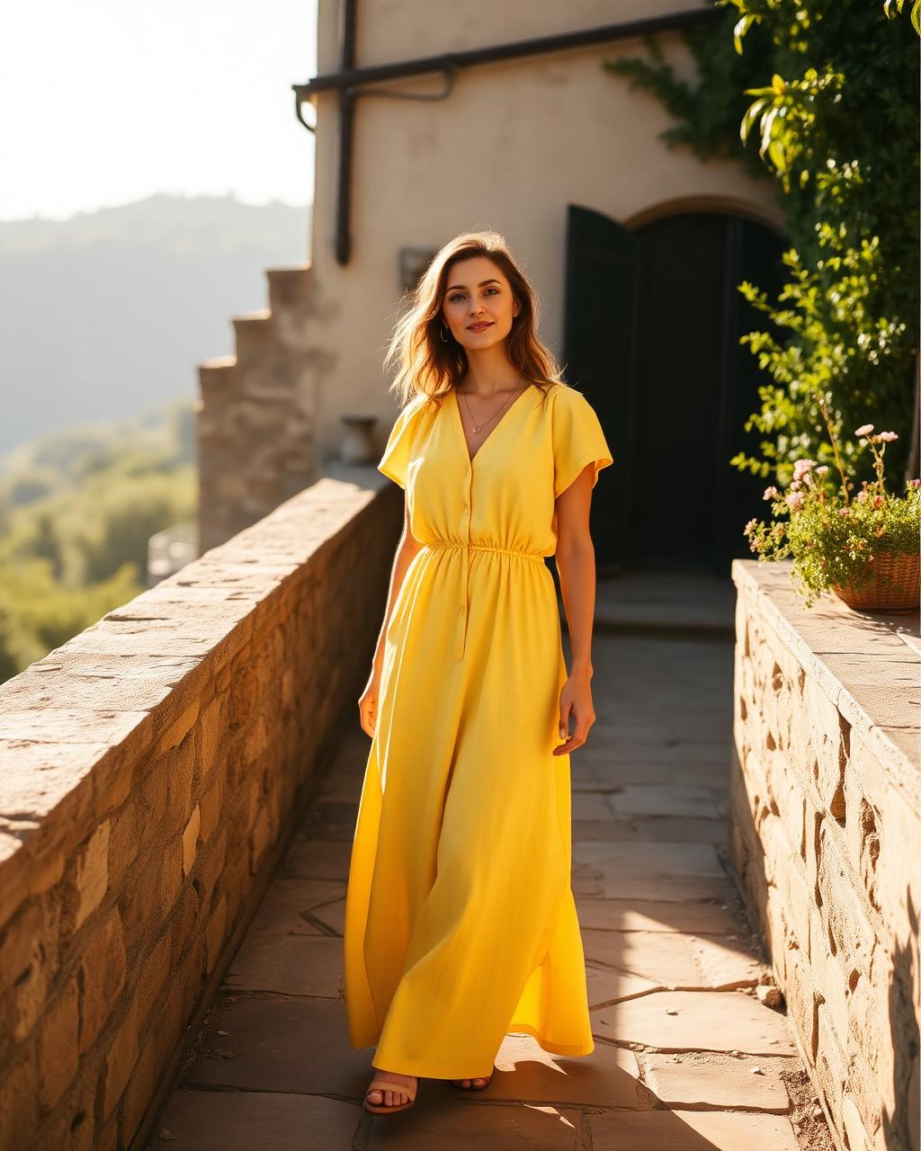
Butter yellow is the shade that convinced the sceptics. Softer than lemon, warmer than cream, closer to Normandy butter than to anything primary, it has moved in three seasons from a runway curiosity at Zimmermann and Max Mara to a genuine wardrobe staple.
Its great virtue is that it behaves like ivory with a pulse. Put it beside cream, white, stone or pale grey and it simply looks like a warmer version of the same idea — but it lifts the face in a way that ivory cannot. In strong Mediterranean light it becomes almost luminous; in northern winter light it does the useful work of standing in for the sun.
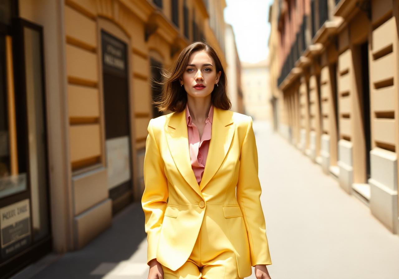
Wear it in the largest possible piece. A butter yellow linen dress on holiday. A butter yellow blazer over white trousers in the city. A butter yellow cashmere sweater with dark denim and cognac loafers. Where it stumbles is in synthetics and in small doses — a yellow accessory reads as an accent, which is precisely the loudness this palette is trying to avoid.
Accessories should stay quiet and warm: raffia, straw, tan leather, brushed gold, tortoiseshell sunglasses. The colour is already the event.
Chocolate Brown: The Grown-Up Black
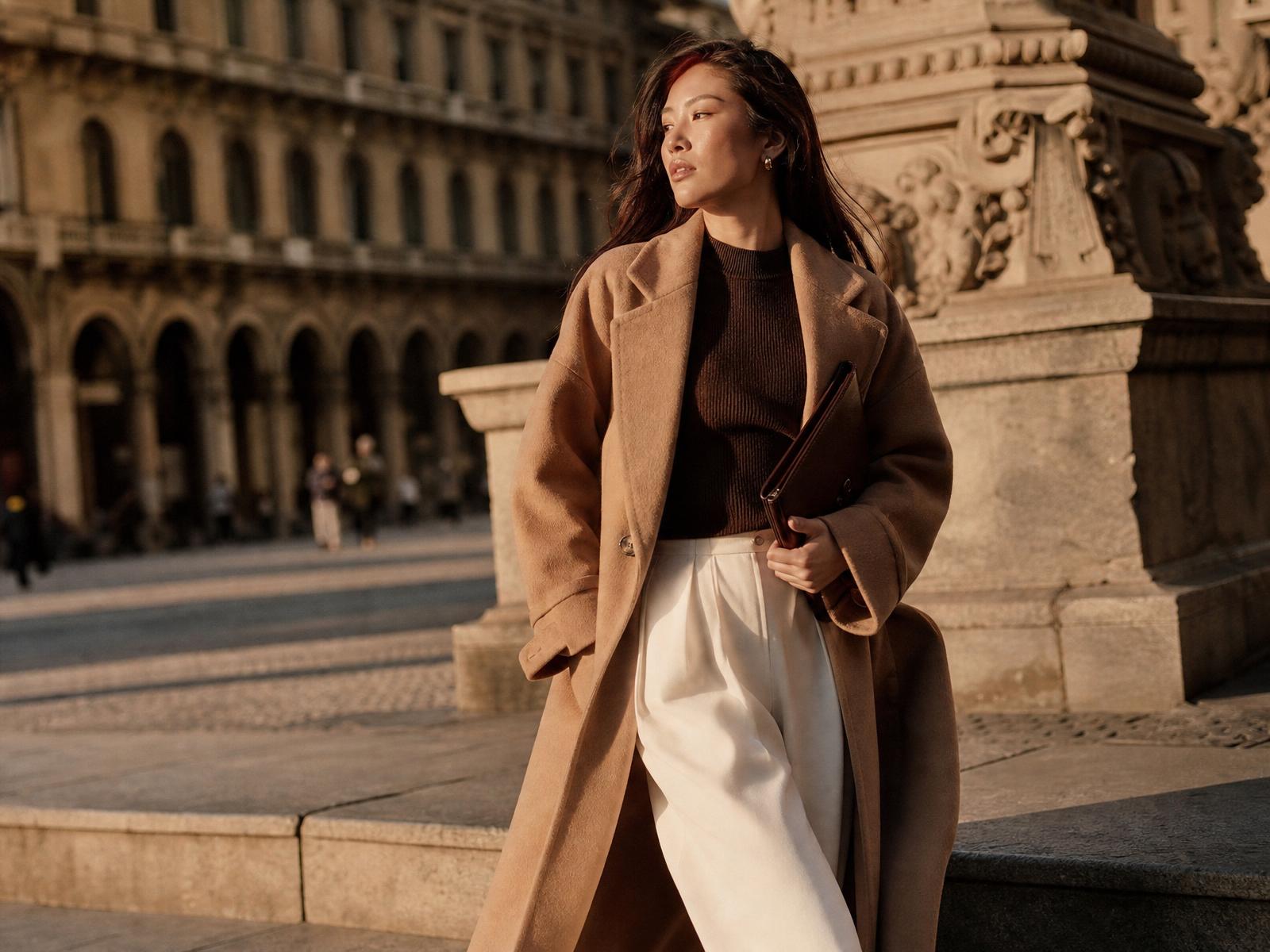
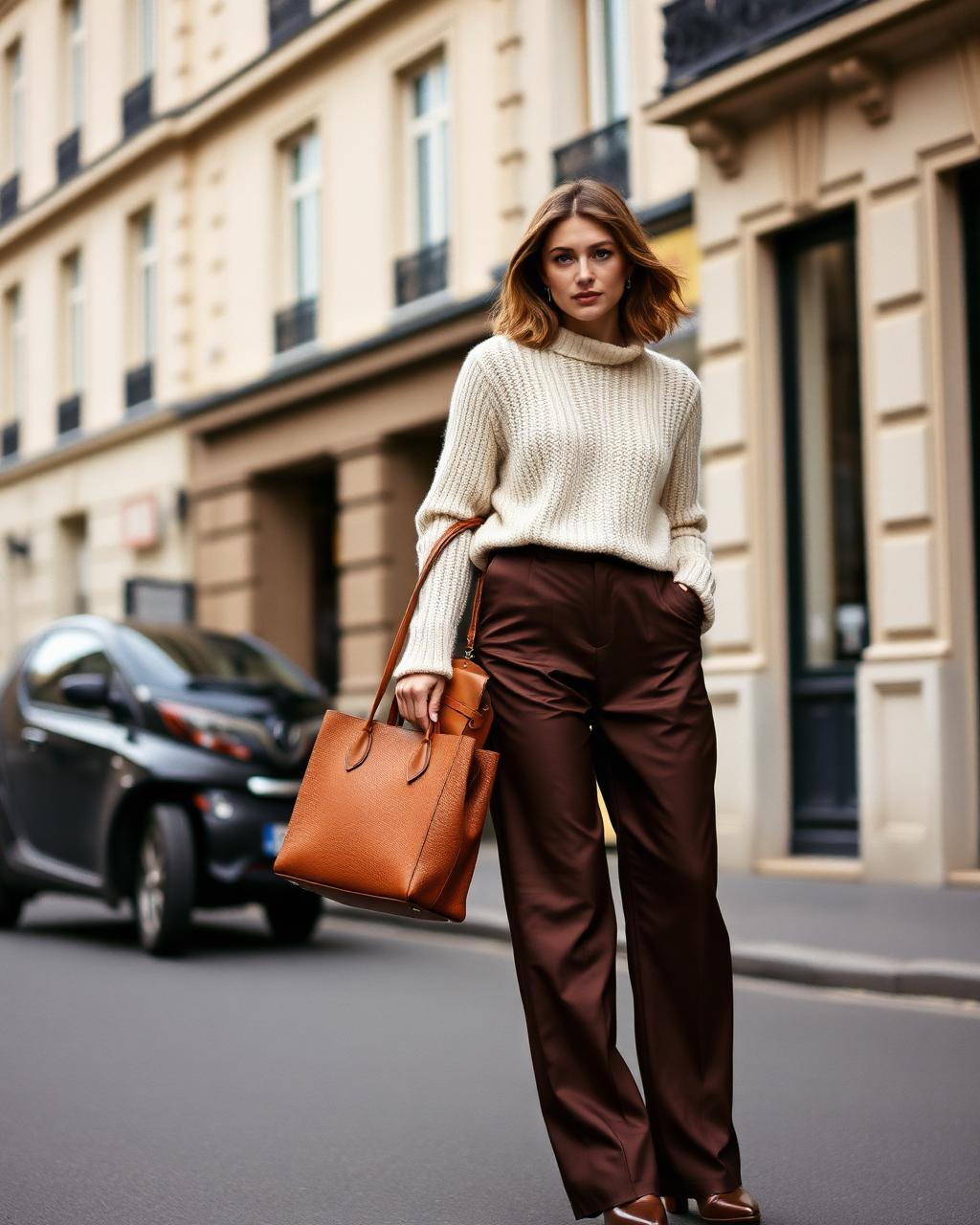
If one colour has done the most to modernise the luxury wardrobe, it is chocolate brown. It has, quite simply, replaced black for daytime. It is softer against the skin, richer in photographs, and it carries none of black's slight formality — which is why Toteme, The Row and Max Mara now build entire pre-collections around it.
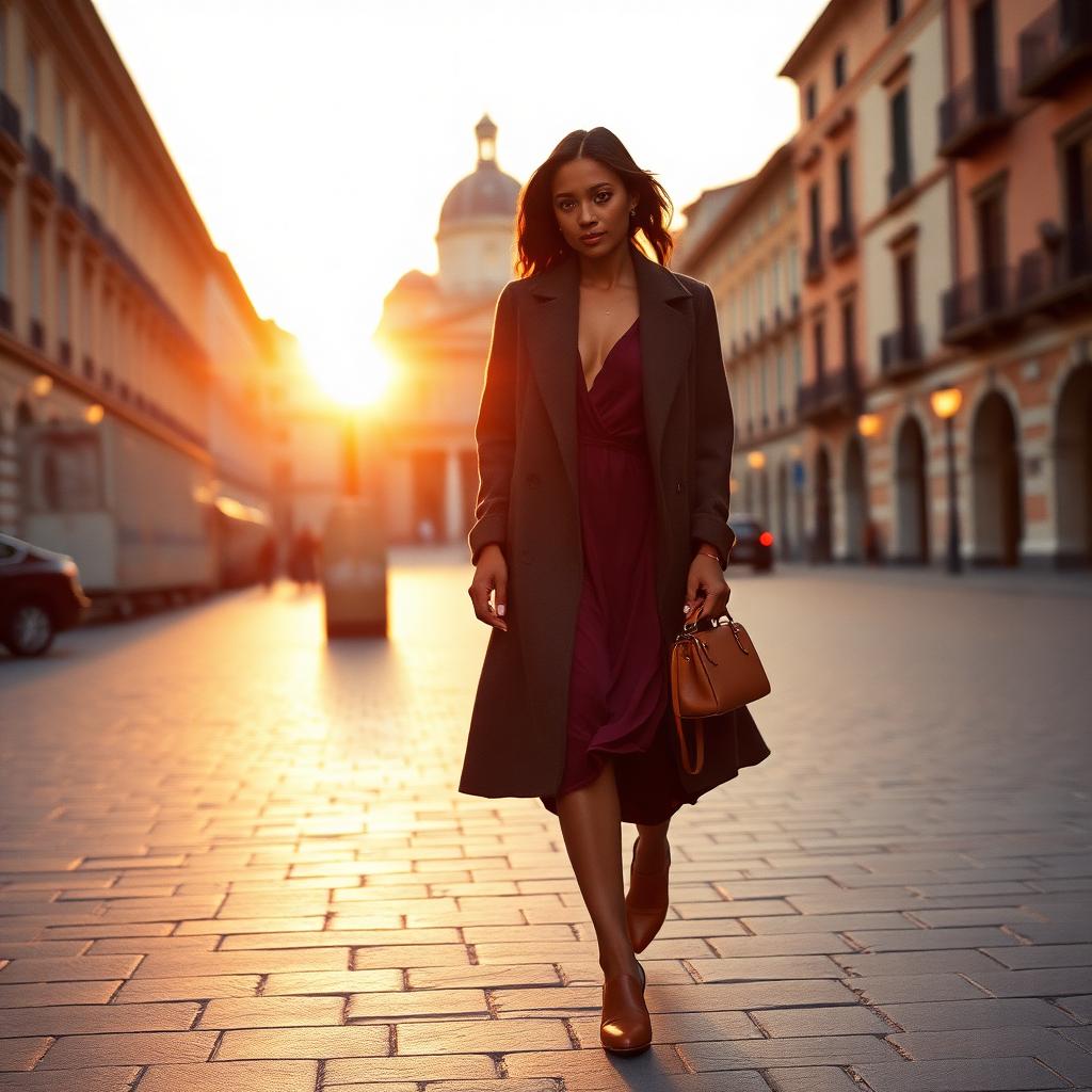
Brown works because it makes every other colour in this palette look better. Baby pink beside chocolate is romantic without being sweet. Butter yellow beside chocolate is warm and slightly Seventies in the best way. Sage green beside chocolate is pure Umbrian countryside. Burgundy beside chocolate is the most expensive thing you can wear in November.
The pieces worth investing in: a chocolate wool trouser with a proper break, a chocolate silk slip skirt, a chocolate leather bag that will still be handsome in fifteen years, and — if the budget allows — a chocolate cashmere coat, which is the single most useful garment a woman can own between October and March.
One caution: brown is unforgiving of cheap fabric. In a poor synthetic it turns muddy. In wool, silk, suede or fine cotton it turns to velvet.
Soft Blue and Sage Green: The Calm Colours
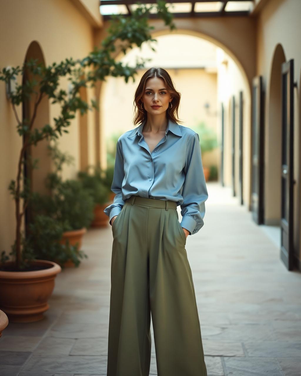
Soft blue — the blue of a well-washed oxford shirt, of faded Delft, of the Mediterranean at seven in the morning — is the most underrated colour in fashion. It reads as neutral, it suits every complexion, and it carries an air of ease that no other colour manages. Loro Piana has been quietly perfecting it in cotton and cashmere for years.
Sage green is its natural companion: grey-green, dusty, close to the underside of an olive leaf. Together they form the calmest pairing in this palette, and one of the most European. A soft blue silk shirt with sage wide-leg trousers is the kind of outfit that looks considered in Milan and entirely unremarkable in the best way in Rome.
Both colours reward simplicity. No print, no hardware, no contrast stitching. Add cream or ivory to lift, cognac leather to warm, gold jewellery to finish. In summer, both are extraordinary in linen; in winter, both are extraordinary in cashmere; in between, cotton poplin does the work.
Editor's tip: if you find blue difficult, start below the waist. A soft blue trouser is easier to place in an existing wardrobe than a soft blue top, and it makes every white shirt you own look new.
Burgundy: The Evening Argument
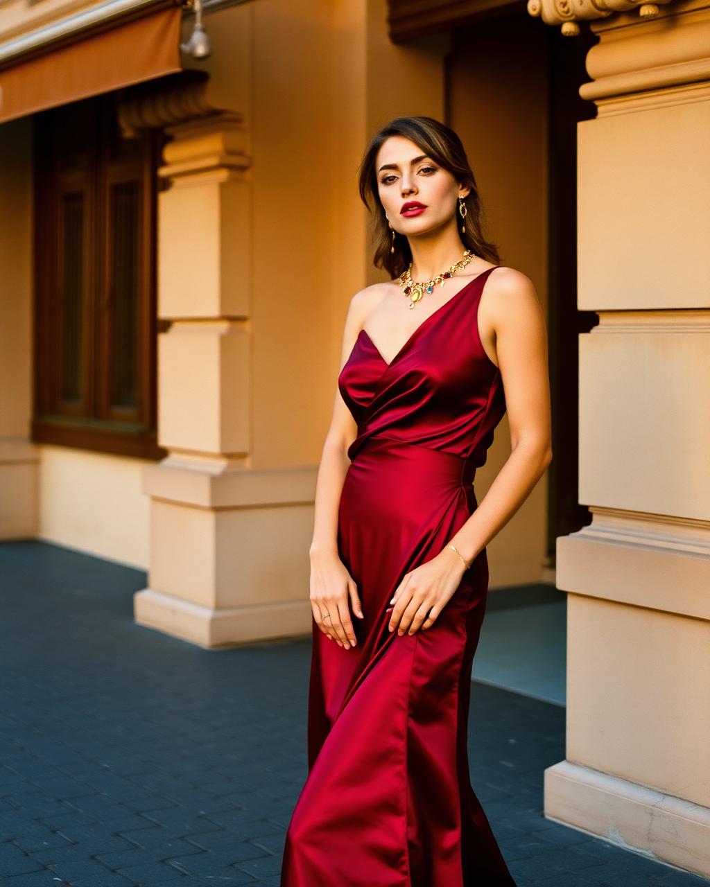
Burgundy is the colour that ends the day. Deeper than red, warmer than plum, it has the particular quality of looking expensive in almost any fabric — though in silk it is close to unimprovable. Ferragamo and Khaite have both built recent collections on its authority.
It functions in the wardrobe as a dark neutral: it will do everything black does at dinner, but with more warmth in the face. A burgundy silk slip dress with bare skin and gold. A burgundy knit over chocolate trousers. A burgundy velvet blazer in December, worn with nothing more complicated than cream.
Where burgundy earns its keep is in accessories, which is unusual for this palette. A burgundy leather bag or a burgundy suede boot introduces the colour into an otherwise neutral wardrobe without any commitment, and both look far more considered than their black equivalents.
Keep the metals gold, the makeup warm, and resist pairing burgundy with true red. The two are too close to be interesting and too different to be harmonious.
Floral and Printed Trousers: The New Statement Piece
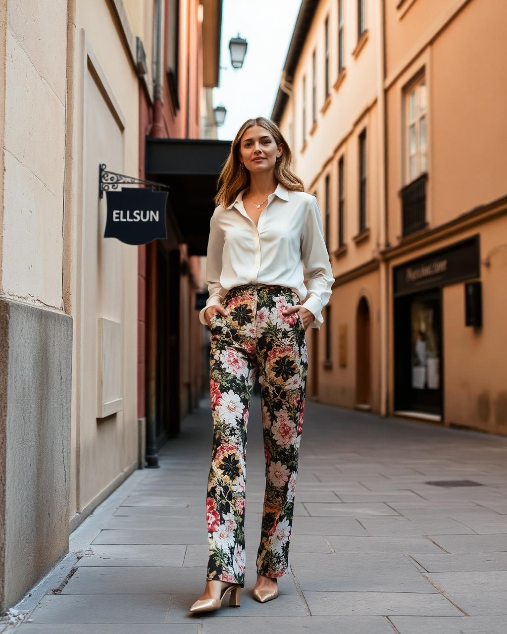
The most interesting development of the season is not a colour at all. It is the printed trouser — and specifically the floral trouser, which has been rescued from its holiday-brochure past by a group of houses who understand scale and restraint.
Etro and Pucci, of course, have been in this business for decades, and both have spent the last few seasons refining rather than amplifying: smaller repeats, muted grounds, prints that read as texture from three metres away. Zimmermann has done something similar with garden florals rendered in soft, sun-faded palettes. Even Toteme, hardly a print house, has introduced abstracted botanical motifs in silk. The result is a printed trouser that looks nothing like a resort souvenir.
The styling rule is unbreakable: one loud piece, everything else silent. A floral trouser wants a plain silk or poplin shirt in a colour lifted directly from the print, flat sandals or a low block heel, and a bag in a warm neutral. No printed top. No statement jewellery. No competing texture. The trouser is the outfit.
Choose the print by scale. Small, dense prints read as texture and are the most wearable in a city. Large, painterly prints are more dramatic and better suited to holiday and evening. And choose the ground carefully — a print on a cream, chocolate, navy or black ground will always look more expensive than one on white.
For fabric, silk twill and cotton poplin are the two that make a print look luxurious; the first drapes, the second holds a crease. Avoid printed viscose, which is what separates a good floral trouser from a cheap one at fifty paces.
How to Combine Colours Elegantly
There is no mystery to elegant colour, only a handful of principles that fashion editors apply so automatically they rarely bother to explain them.
The first is shared undertone. Colours that carry the same warmth or coolness will always harmonise. Baby pink, butter yellow, chocolate, cognac and cream are all warm; they can be combined almost at random and will look deliberate. Soft blue, sage and grey are cool; the same is true of them. Trouble arrives when a warm colour meets a cool one without a neutral between them.
The second is two colours, one neutral. Three saturated tones in one outfit is a costume; two colours anchored by cream, ivory or camel is a look. If you want a third, let it be a shoe or a bag.
The third is tonal repetition. Repeating one colour in three different textures — a sage linen trouser, a sage silk shirt, a sage cotton knit over the shoulders — is the most reliably expensive-looking thing in fashion, and it requires no colour theory at all.
The fourth is keep the hardware quiet. Gold rather than silver with this palette, no logos, no contrast buckles, no visible branding. Colour is already an assertion; anything else competes.
And the fifth, the one that matters most: match the colour to the light you live in. Butter yellow and pink flourish in southern sun. Chocolate, burgundy and sage hold up beautifully under northern grey. Buy for the sky you actually stand under.
- Baby pink + chocolate brown — romantic, warm, and the most modern pairing of the year.
- Butter yellow + cream — a tonal wash that reads as light rather than colour.
- Soft blue + sage green — calm, European, effortless in linen.
- Burgundy + camel — the evening-into-autumn combination that never dates.
- Sage green + ivory + cognac — the Tuscan formula, appropriate almost anywhere.
- Printed trouser + one colour drawn from the print — the only reliable way to wear a print.
Fabrics That Elevate Colour
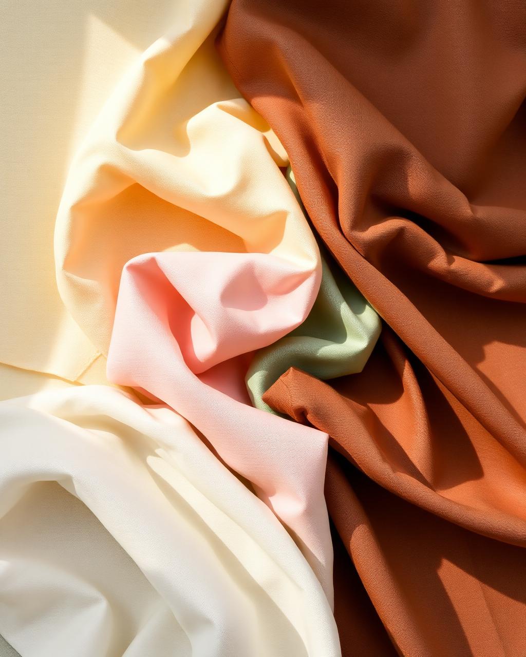
Colour is not really about colour. It is about the surface the colour sits on. The same butter yellow will look like a couture piece in silk crepe and like a school uniform in polyester, because fabric determines how light behaves — and light is what makes a colour look expensive.
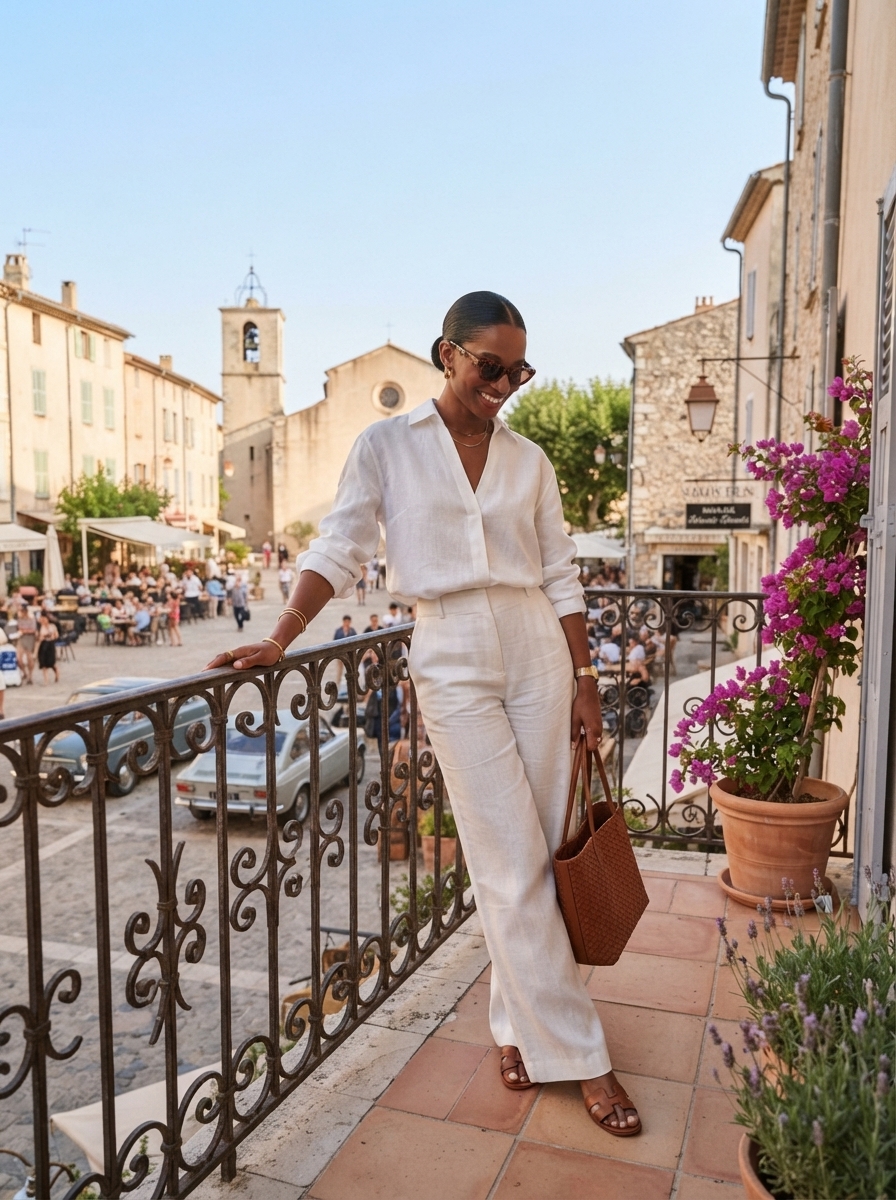
Linen is the most forgiving. Its slubbed, irregular surface breaks colour into a hundred tones, which is why even a strong colour in linen looks sun-softened rather than loud. It is the correct fabric for butter yellow, sage and soft blue in summer, and the reason Loro Piana's summer palettes photograph as they do.
Silk is the most flattering. Because it reflects rather than absorbs, colour in silk appears deeper and more liquid — burgundy, chocolate and baby pink all reach their best form here. Look for heavier weights: silk crepe, silk twill, sandwashed silk. Thin, shiny silk reads as cheap regardless of the price.
Cotton poplin is the most modern. Crisp, matte and structured, it holds a colour flat and clean and gives pastel shades the architectural quality that keeps them from turning sweet. It is the reason a baby pink poplin shirt looks like Khaite and a baby pink jersey top does not.
Fine wool and cashmere carry the winter half of this palette. Chocolate, burgundy and sage in cashmere have a depth no other fibre reproduces. And a note on what to avoid: printed viscose, shiny satin polyester and anything described as a 'silky' blend. These fabrics flatten colour and are the single most common reason a colourful outfit looks inexpensive.
How Luxury Brands Are Using Colour Today
It is worth watching how the houses themselves handle this, because their restraint is instructive. Toteme treats colour as an extension of neutrality: chocolate, stone, faded blue, and a pink so muted it might be a beige. The Row uses colour almost architecturally — one tone, one silhouette, no interruption. Khaite is sharper, cutting pale blue and dusty pink into tailoring severe enough to keep them from ever reading as pretty.
Loro Piana and Max Mara approach it through fibre. Their colours are chosen for how a particular cashmere or linen holds them, which is why their sage, butter and camel look like objects rather than shades. Ferragamo has taken the opposite route, building a whole identity on a single saturated red and letting everything else recede around it.
Then there are the print houses. Zimmermann renders florals in sun-faded palettes that feel more Provençal garden than tropical resort. Etro continues to be the great authority on paisley and botanical motifs, increasingly at smaller scale. Pucci, custodian of the most recognisable print in Italian fashion, has spent recent seasons scaling its swirls down and muting its grounds — a print you can wear to lunch rather than to a party.
The common thread is discipline. None of these houses is using colour to be noticed. They are using it to be specific — and specificity, in the end, is what luxury actually means.
Colour is not the opposite of elegance. Saturation is.
Building a Timeless Colour Palette Instead of Following Trends
A trend palette changes every season. A personal palette changes roughly never — and it is the only reliable defence against a wardrobe full of things that do not speak to one another.
Begin with two foundation neutrals. Cream and chocolate is the most versatile pair in 2026; navy and camel is the classic alternative. These are your coats, trousers, bags and shoes — the pieces you buy once and keep.
Add two signature colours: the ones that flatter you specifically, that you reach for without thinking. For most warm complexions that is butter yellow and baby pink; for cool complexions, soft blue and sage. Choose by looking at your own face in daylight, not by looking at a runway.
Add one evening depth — burgundy, ink, or a very dark green — and one accent, which can be a print, a bag, a shoe, or nothing at all. That is five or six tones in total, and every piece you own should sit inside them.
The test is simple: pull any two garments from your wardrobe at random. If they work together, the palette is doing its job. If they do not, you have been buying seasons rather than a wardrobe.
Done properly, this is what allows a woman to dress in colour and still look restrained — and to keep looking that way long after butter yellow has stopped being a headline and become, simply, a colour she wears.
- Two neutrals — cream and chocolate, or navy and camel. Coats, trousers, bags, shoes.
- Two signature colours — chosen in daylight, against your own face.
- One evening depth — burgundy, ink or dark green, ideally in silk.
- One accent or print — a floral trouser, a burgundy bag, or nothing.
- One metal — gold or silver, consistently. Never both.
Colour, worn this way, is not a departure from quiet luxury. It is its next chapter. The discipline is unchanged — good fabric, clean lines, nothing shouted — but the vocabulary has widened, and the wardrobe is warmer for it.
Start with one piece. A baby pink silk shirt, a butter yellow linen dress, a chocolate trouser, a floral trouser worn with a plain blouse. Live with it for a season and see how the rest of your wardrobe rearranges itself around it.
That is, in the end, how a palette is built: not in a single purchase, but in a series of quiet, deliberate ones.
Disclosure · The selections below were independently chosen by our editors. Some links are affiliate; we may earn a small commission when you shop through them.
Curated · Tested · Recommended
Suggested to Shop
The pieces mentioned in this story, in one place — independently chosen by our editors.
- 01
The Colour Edit
Printed & Floral Trousers
Small-repeat prints on cream, chocolate or navy grounds, in silk twill or cotton poplin. Worn with a plain shirt in one colour drawn from the print.
- 02
The Colour Edit
Baby Pink & Butter Yellow Dresses
Butter yellow linen for daylight, baby pink poplin for the city, burgundy silk for evening — colour in the largest possible piece.
- 03
The Colour Edit
Linen & Poplin Separates
The sage trouser, the soft blue shirt, the pink poplin shirtdress: the pieces that carry the palette through the week.
- 04
The Colour Edit
Bags in Cognac & Burgundy
One warm neutral for every day, one burgundy for autumn. No hardware, no logo, no interruption.
- 05
The Colour Edit
Flat Sandals & Low Block Heels
Tan leather for summer, chocolate for the city — the quiet foundation that lets colour do the talking.
- 06
The Colour Edit
Brushed Gold Jewellery
One chain, one pair of hoops, one cuff. Gold flatters every tone in this palette; silver cools them.
- 07
The Colour Edit
Tortoiseshell Sunglasses
Honey or tortoise acetate, which sits warmly beside pink, butter yellow and chocolate alike.
Some links are affiliate. We may earn a commission at no cost to you.