Color Combinations for Outfits: Elegant Pairings That Look Expensive
Expensive style has never been about wearing only black, white or beige. It is about the quiet intelligence of a well-considered palette — the colours that flatter the room, the light and each other.
By Marguerite Lane · July 14, 2026 · 12 min read
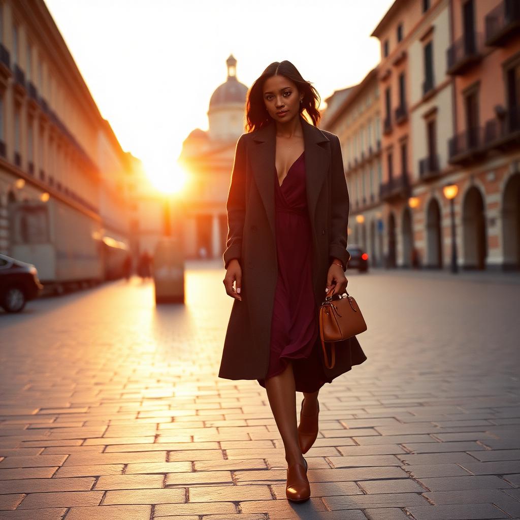
There is a particular kind of woman one notices on a Milanese sidewalk or crossing a hotel lobby in Paris — not because her clothes are loud, but because they are, unmistakably, in tune. Her burgundy skirt speaks softly to her chocolate knit. Her cream trousers catch the shadow of her olive coat. Nothing shouts. Everything belongs.
For all the received wisdom that expensive style is a monochrome business — black, white, beige, repeat — the women who look most convincingly luxurious tend to do something more interesting with colour. They pair. They temper. They repeat a single warm tone across three different textures and let the outfit do the work.
Colour, thoughtfully deployed, is one of the fastest ways to elevate an outfit. It flatters the face in a way neutrals cannot. It signals confidence without effort. And, most importantly, a well-balanced palette often reads more sophisticated than the safest all-black tailoring — because it suggests someone who chose, rather than someone who defaulted.
What follows is a considered guide to the colour combinations that consistently look expensive: the classic pairings, the unexpected ones, the monochromatic dressing that never dates, and the small principles fashion editors use to make it all look effortless. Save what you love. Wear what feels like you. And remember that luxury, in the end, is a matter of harmony.
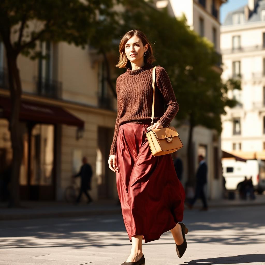
1. Burgundy and Chocolate Brown
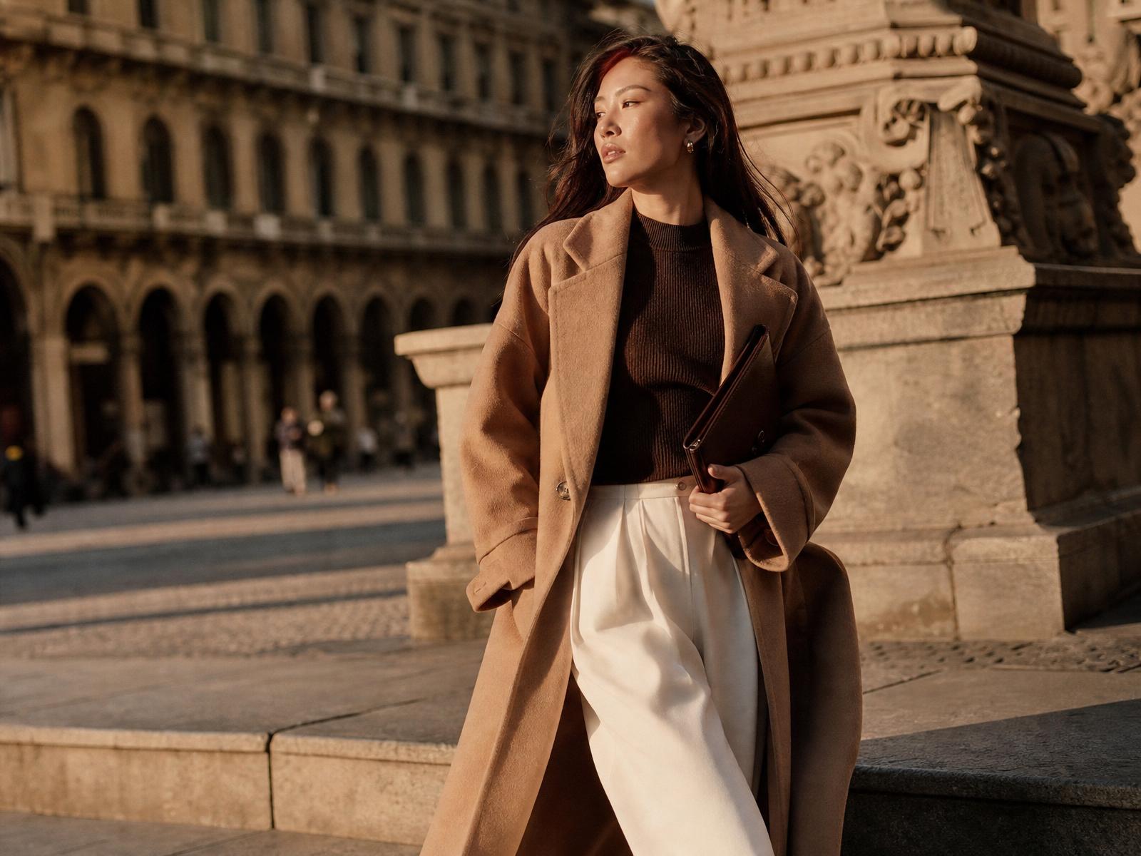
Few pairings feel as instantly luxurious as burgundy and chocolate brown. There is something in the warmth of both tones — the depth of aged wine, the softness of dark cocoa — that suggests interiors dressed in velvet, libraries with wood-panelled walls, the last of the autumn light through a Parisian window. It is the palette of a woman who reads slowly and drinks her coffee at a table.
The reason the combination works is that both colours share an undertone. Burgundy is essentially a red flushed with brown; chocolate is a brown warmed with red. They do not clash because they are, on some deeper level, related — a family resemblance that reads as harmony rather than contrast. The eye moves comfortably between them.
To style the pairing, keep the silhouettes clean and the fabrics considered. A burgundy silk midi skirt with a chocolate cashmere sweater; a chocolate wool trouser with a burgundy silk blouse; a burgundy coat over a chocolate turtleneck and cream trousers. The pairing rewards restraint — one loud accessory will unbalance it entirely.
For accessories, stay within the warm-neutral family. Camel, cognac, ivory, tortoise, gold. Skip cool metallics and stark black; they interrupt the mood. A soft cognac leather handbag and matching loafers is the answer nine times out of ten.
Best worn from late September through early spring, when the light itself has warmed. For summer, the same idea can be translated in lighter weights — burgundy linen with a chocolate cotton — but the palette lives most naturally in cooler months.
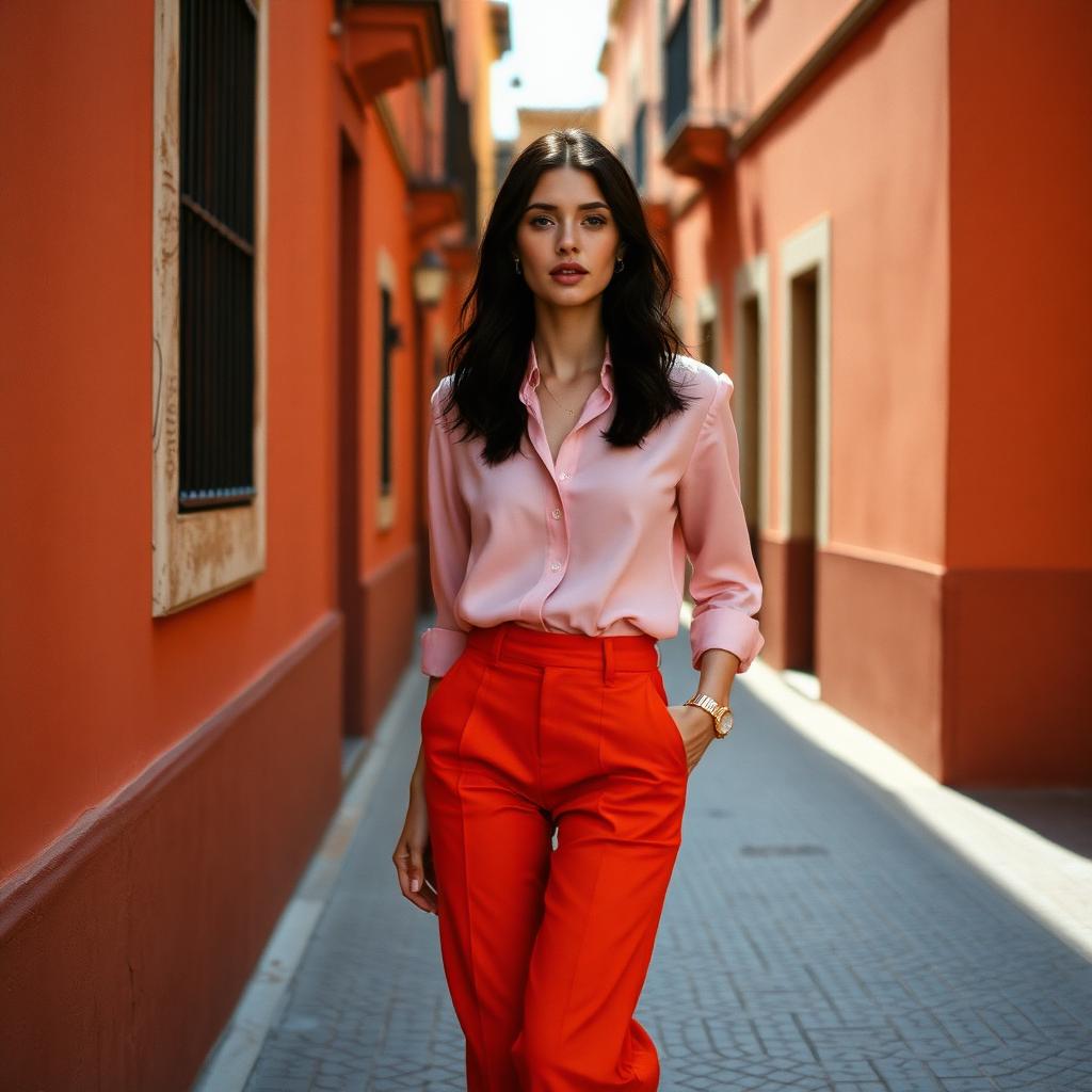
2. Pink and Orange
The most persistent myth in modern fashion is that vibrant colour and elegance cannot coexist. A single afternoon at Paris Fashion Week — or a scroll through Jacquemus's runway archive — will settle the argument. Pink and orange, worn with intention, is one of the most sophisticated pairings in contemporary style.
The trick is tone. Not bubblegum with neon, but a soft, chalky pink against a burnt orange, or a rosy powder pink against a deep tangerine. Both colours should share warmth, and both should feel a shade lower in saturation than their loudest versions. Think of dusty rose against terracotta rather than fuchsia against safety orange.
Tailoring rescues the pairing from any hint of costume. A silk blouse in soft pink tucked into a tailored orange trouser reads editorial; the same colours in a T-shirt and cotton skirt reads like a cheerleader. Structure is what makes bright colour look expensive.
Keep accessories quiet. Nude leather, ivory, soft camel, minimal gold jewellery. The colours are already doing the talking; anything more competes. A single well-cut leather bag in a warm neutral is usually the entire accessory conversation.
This is a summer pairing, best worn in strong Mediterranean light — the sun does something forgiving and beautiful to warm colours that overhead office lighting cannot replicate. If you love it but feel hesitant, begin with a single piece. A pink silk blouse over cream trousers, with a pair of orange leather flats. That is enough.
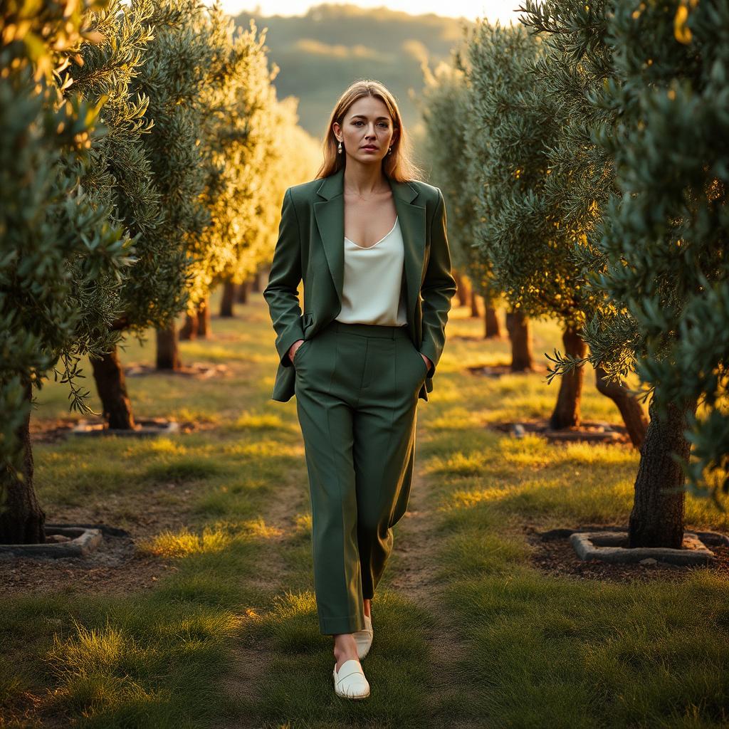
3. Olive Green and Cream
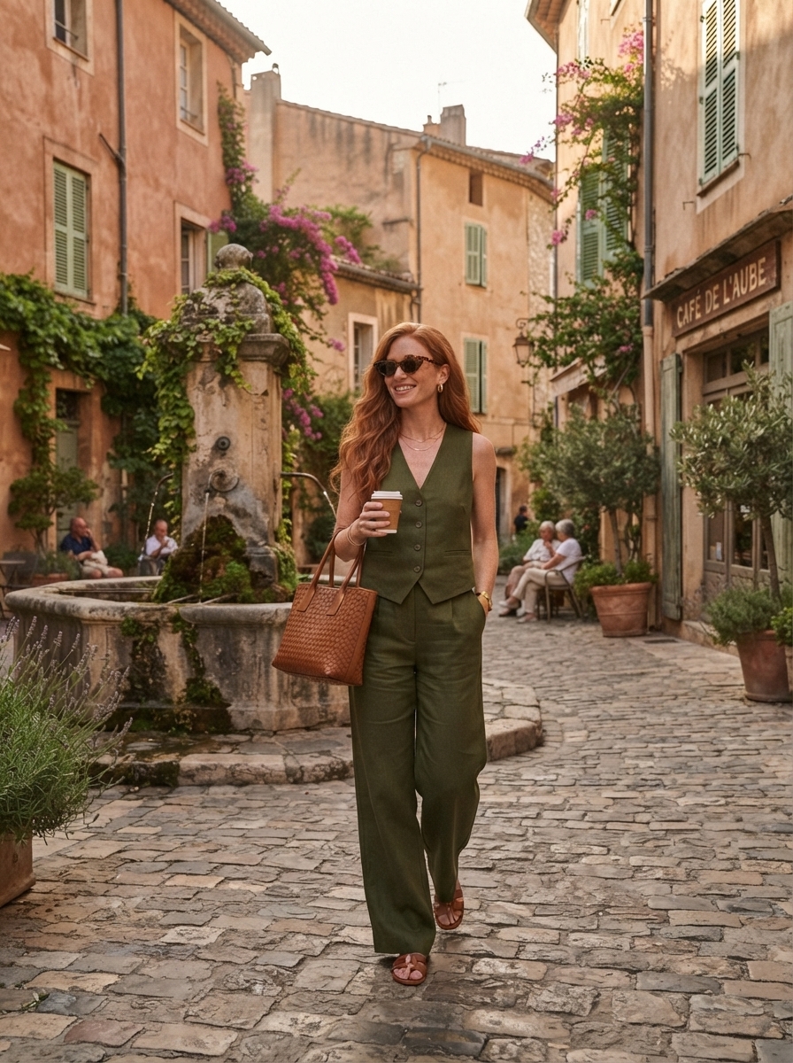
If quiet luxury has a signature colour story, it is this one. Olive and cream — the palette of the Tuscan countryside, of Loro Piana campaigns, of a linen tablecloth under a lunch of tomatoes and burrata. It is the most European combination in the modern wardrobe, and it never dates.
Olive is the great chameleon of the colour wheel: warm enough to read as a neutral, complex enough to feel considered. Paired with cream — softer and warmer than a stark white — it flatters nearly every complexion and photographs beautifully in natural light. Together they read as ease rather than effort.
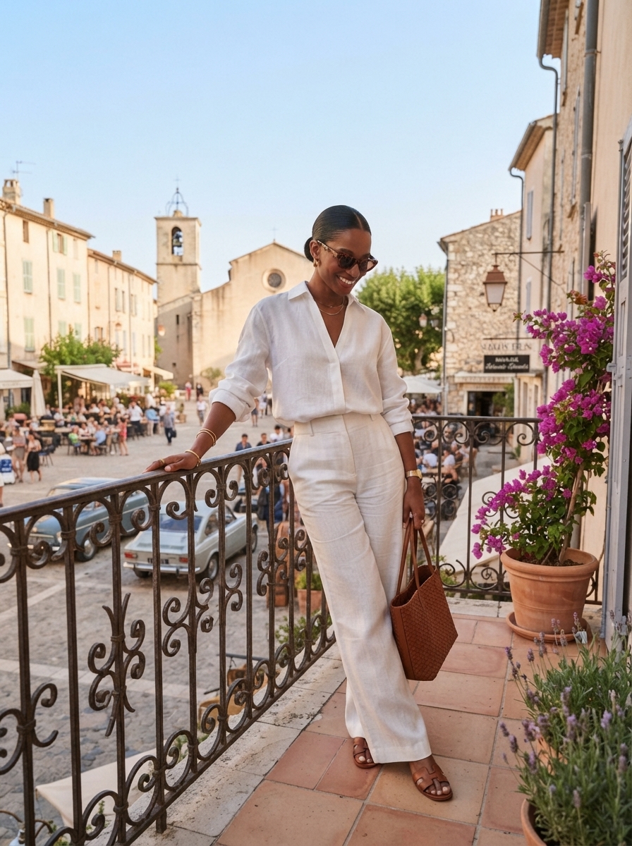
The pairing works across seasons and formality levels. A cream silk camisole under an olive linen suit for summer travel. A cream cashmere sweater tucked into olive wide-leg trousers for a weekend lunch. An olive trench over cream trousers for an unhurried city day. Each version reads the same: intentional, unshowy, expensive.
For accessories, stay in the earth-tone family. Cognac leather, ivory suede, brushed gold jewellery, tortoise sunglasses. A woven raffia bag in summer, a cognac tote in autumn. Nothing shiny; nothing severe.
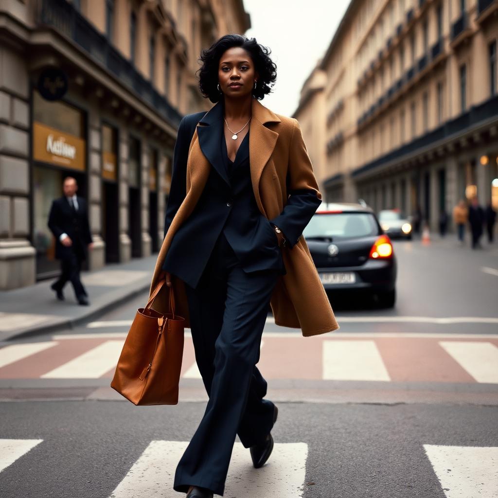
4. Navy and Camel
Navy and camel is the modern woman's answer to the traditional office wardrobe. Sharper than beige and softer than black, it is the pairing that has quietly powered a decade of Toteme, The Row and Loro Piana campaigns — and, before them, the wardrobes of every well-dressed woman who has ever walked into a Milan boardroom looking like she meant it.
The two colours flatter each other precisely because they are opposites. Navy is cool, dense, formal. Camel is warm, soft, forgiving. Together they create a balance no single neutral achieves alone — the seriousness of navy warmed by the ease of camel, the polish of camel anchored by the weight of navy.
For workwear, the formula almost writes itself: navy tailored trousers, a navy blazer or blouse, and a camel cashmere coat draped over the shoulders. A camel leather tote. Loafers or a low block heel in either colour. The look is unimpeachable — appropriate in a boardroom, elegant on a plane, easy to repeat five days a week without ever looking uniform.
Away from the office, the pairing translates beautifully. A camel knit with dark denim. A navy silk slip dress under a camel trench. A camel wool coat over navy wide-leg trousers on a cold Saturday. It is, quite simply, one of the most useful colour combinations in a modern wardrobe.
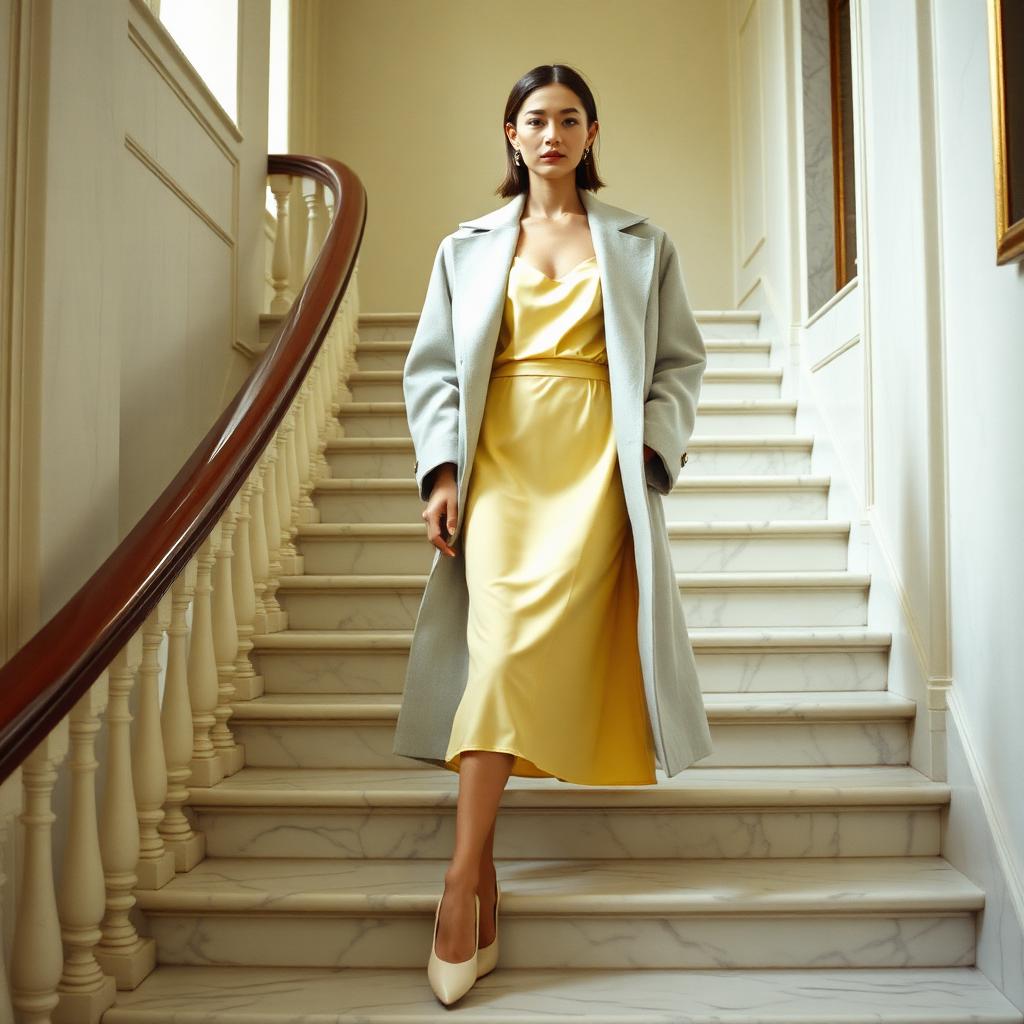
5. Butter Yellow and Light Grey
Butter yellow has been the sleeper hit of the last two seasons. Softer than lemon, warmer than cream, closer to a well-churned Normandy butter than to primary yellow — it is the shade Sandy Liang, Khaite and Zimmermann have been quietly pushing since 2024, and it is here to stay.
The colour needs a partner that does not compete, and light grey — dove, pearl, oyster — is the ideal foil. Where a stark white can make butter yellow look chalky, and black can make it look childish, a soft grey lets the yellow glow. The pairing feels contemporary rather than sweet, and quietly optimistic in a way most palettes are not.
Silhouette matters here. Butter yellow reads most sophisticated in fluid fabrics — silk, satin, fine wool, brushed cotton — rather than anything stiff or shiny. A butter yellow slip dress under a dove grey coat. A pale grey knit tucked into butter yellow trousers. A yellow silk blouse with grey wide-leg wool.
Accessories should be minimal and modern. Ivory leather, brushed silver or white gold, a pale grey bag in a clean shape. Skip anything ornate; the colour story is already doing the delicate work.
6. Emerald Green and Black
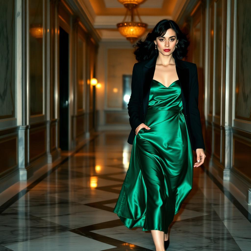
Emerald and black is one of the most confidently elegant pairings a wardrobe can hold. It is the palette of evening — of long dinners, of theatre, of the walk from the car to the restaurant on a night that matters — but it has quietly earned a place in daytime dressing too. A black tailored trouser with an emerald knit is one of the most under-used office combinations in modern fashion.
What makes it work is contrast in the right register. Black is the deepest neutral; emerald is the richest jewel tone. Together they read as considered rather than costume — the kind of pairing that reads instantly luxurious in photographs and even better in person, where the sheen of good satin catches the light.
For evening, the formula is close to unimprovable: an emerald green satin slip dress with a sharply tailored black blazer, black leather pumps, and gold jewellery in the smallest possible dose. A black satin clutch. A red lip if the mood permits. It is Saint Laurent, essentially, filtered through a modern hand.
For daytime, temper the drama. A dark emerald cashmere sweater with black wool trousers and loafers. A green silk blouse under a black blazer. A green wool coat over an all-black outfit. Keep the fabrics matte and the shapes clean, and the pairing reads professional rather than theatrical.
7. Powder Blue and Chocolate
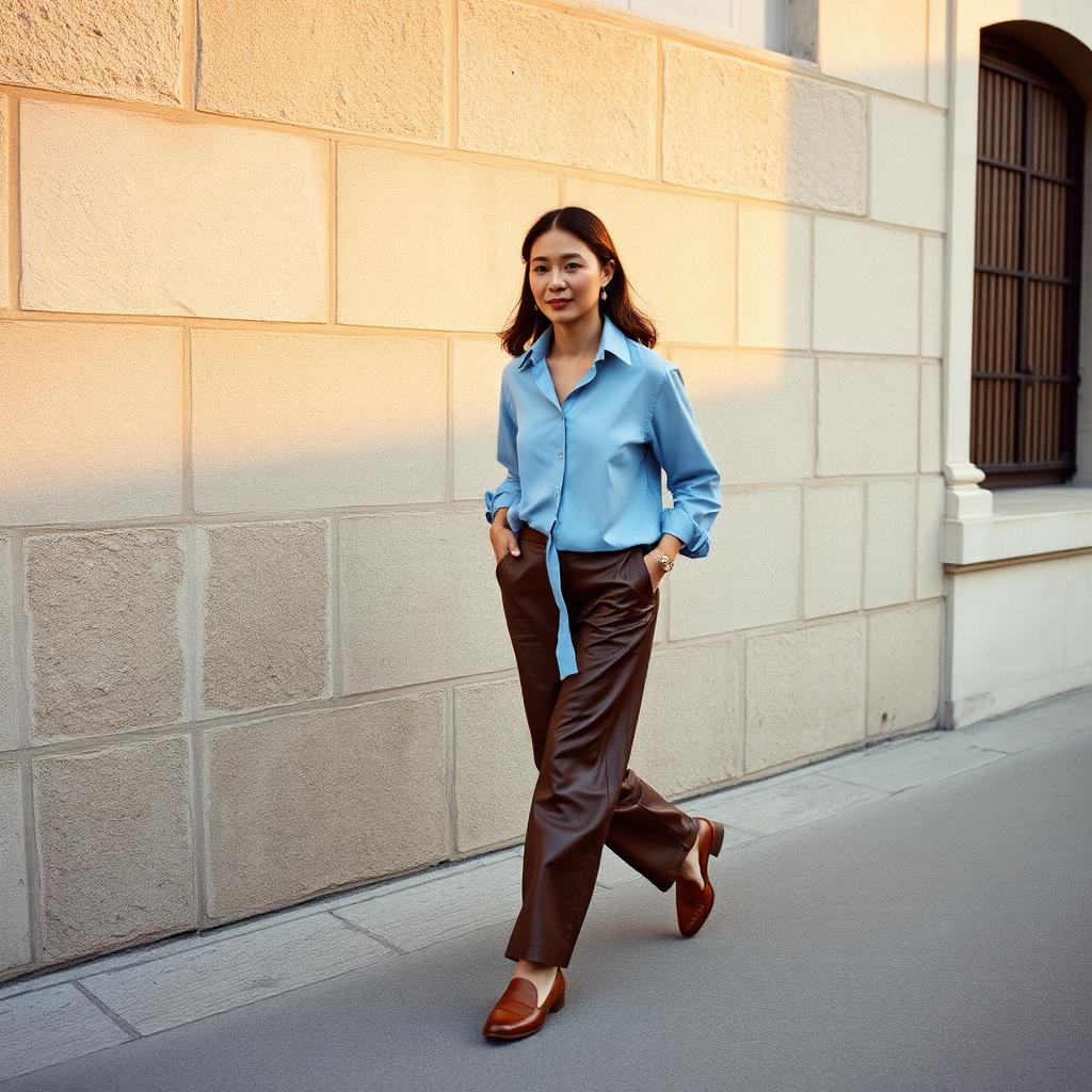
The most quietly sophisticated pairings tend to be the ones you did not expect. Powder blue and chocolate brown is exactly that — a combination that feels obvious the moment you see it, but almost no one had considered before. It is what happens when you take the softness of a Nordic sky and pair it with the depth of a leather library chair.
The pairing works because the two colours sit far enough apart to feel intentional, and close enough in saturation to feel harmonious. Neither shouts; neither disappears. Powder blue softens the seriousness of chocolate; chocolate anchors the airiness of blue. Together they read modern without being trendy — a rare and useful combination.
Styling ideas: a powder blue oversized cotton shirt tucked into chocolate leather trousers. A chocolate suede skirt with a powder blue cashmere sweater. A powder blue linen suit worn with a chocolate belt and matching loafers. In every case, the mood is unhurried.
Accessories can lean cognac, cream or brushed gold. The one thing to avoid is any competing cool tone — a silver bag, a black boot, a pearl grey coat will fight the palette. Keep the temperature warm, the shapes clean, and let the colours speak.
8. Burgundy and Charcoal Grey
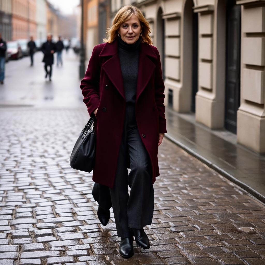
There is a version of European street style — Copenhagen in particular, Milan in its more restrained moods — that lives almost entirely in this palette. Burgundy and charcoal grey. Wool coats over turtlenecks. Cobblestones and rain. Coffee taken standing at the counter. It is one of the most refined combinations in modern dressing and, tellingly, one of the hardest to get wrong.
The combination works because it repeats the elegance of burgundy-and-chocolate in a cooler key. Where chocolate warms the wine, charcoal deepens it — pulls it toward moodiness rather than sweetness. The result reads urban, thoughtful, slightly serious. Very good writers, very good editors, very good architects tend to gravitate here.
For a cold-weather formula, a burgundy wool coat over a charcoal turtleneck and charcoal wide-leg trousers, with black leather boots and a small black bag. In milder weather, a charcoal cashmere sweater over a burgundy silk skirt with black loafers. In summer, translate the mood in lighter fabrics — a charcoal linen shirt with burgundy silk trousers.
Keep accessories in the dark-neutral family. Black, deep brown, oxblood, gunmetal. Silver jewellery works here where it would fail in the warmer burgundy-chocolate story. The overall mood should feel cool rather than warm, considered rather than cosy.
9. Monochromatic Dressing
If there is one styling move that consistently reads as expensive across cultures, seasons and body types, it is monochromatic dressing. A single colour, from head to hem, in varied textures and tonal shifts. It elongates the body, simplifies decisions, and creates the visual sophistication of a well-designed room — every element speaking the same language, quietly.
The mistake most people make is treating monochromatic dressing as identical. A perfectly matched top and bottom in the same fabric can read flat or, worse, like a uniform. The version that reads luxurious is tonal — slight shifts within a single colour family, held together by fabric variation. A cream silk shirt with cream wool trousers and an ivory cashmere coat. A camel knit with a camel suede skirt and cognac boots. Same family, different notes.
The most flattering monochromatic palettes to build a wardrobe around:
- White and ivory — the freshest, most modern option. Reads impossibly chic in summer, especially in linen and cotton. Best kept slightly off-white rather than stark.
- Cream, oatmeal and bone — softer and warmer than white, more forgiving on most complexions. The palette of Aman resorts and Riviera lunches.
- Camel through cognac — the timeless workwear palette. Reads sophisticated in every context, from airport to office to autumn wedding.
- Dove grey through charcoal — the coolest and most urban option. Modern, architectural, unshowy. A quiet favourite of Scandinavian designers.
- Chocolate through espresso — deeply luxurious in autumn. Suede, cashmere, leather, cotton — the mood is dark and unhurried.
- Olive through moss — the most European of the monochromes. Endlessly wearable, particularly beautiful in linen, wool and cashmere.
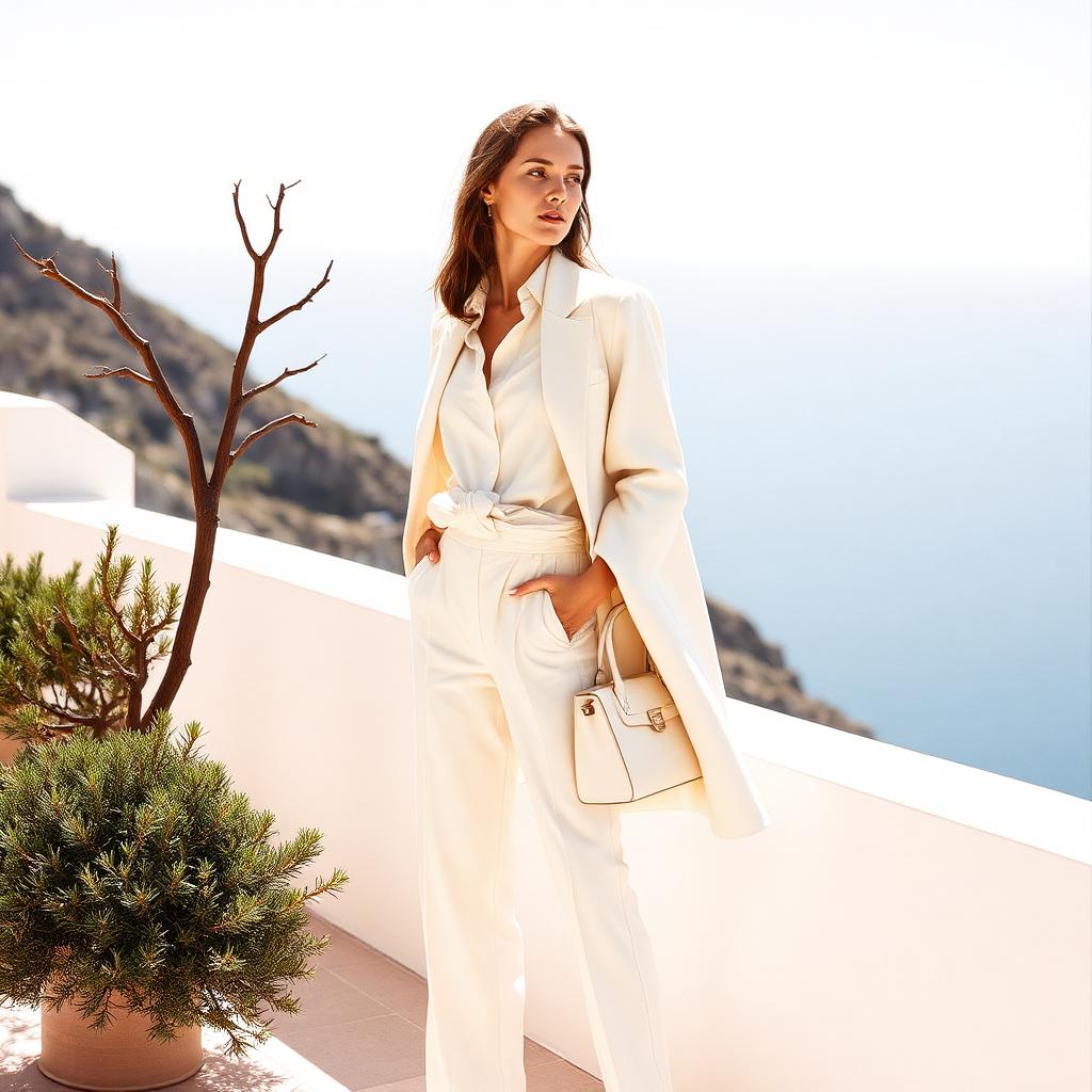
One colour, three textures, and the outfit takes care of itself.
10. How Fashion Editors Mix Colors
The women who dress most convincingly for a living — the fashion editors, stylists, buyers, image directors — tend to follow a handful of quiet rules that shape almost everything they wear. None of them are complicated. All of them are useful.
The first is the rule of one statement colour. If you are wearing something bright, unusual or saturated, let it be the loudest note in the outfit. Everything else should recede — neutrals, tonal accessories, quiet shoes. A red silk blouse deserves cream trousers, not a floral skirt. A cobalt coat deserves everything under it in ivory or black.
The second is one statement, one neutral. Even outside the loud-colour rule, the eye needs a place to rest. Two colours, worn in intentional proportion — one dominant, one supporting — will always look more considered than three or four fighting for attention. The neutral is not filler; it is punctuation.
The third is repeating accessory colours. Editors almost always echo one tone somewhere in the outfit — a burgundy shoe with a burgundy earring, a cream bag matching cream loafers, a gold necklace answered by a gold buckle. The repetition is subliminal, but it is the single most reliable trick for making an outfit look intentional rather than assembled.
The fourth is texture as a second colour. When your palette is quiet — all cream, all camel, all navy — texture takes over the work colour would otherwise do. Silk against wool. Leather against cashmere. Linen against suede. The eye reads texture as depth, and depth reads as luxury.
The fifth is fabric literacy. A cheap fabric in an expensive colour will always read cheap; a beautiful fabric in a difficult colour will read expensive. Buy the fabric first, the colour second. A well-cut silk in a colour you do not love will out-perform a badly cut synthetic in your favourite shade every time.
The last, and most important, is contrast — not of colour, but of formality. The outfits that read most expensive tend to pair one relaxed element with one polished one. A silk blouse with dark denim. A cashmere sweater with a floor-length silk skirt. A tailored blazer with a linen T-shirt. Total polish reads as costume; total ease reads as pyjamas. Somewhere in between is the sweet spot.
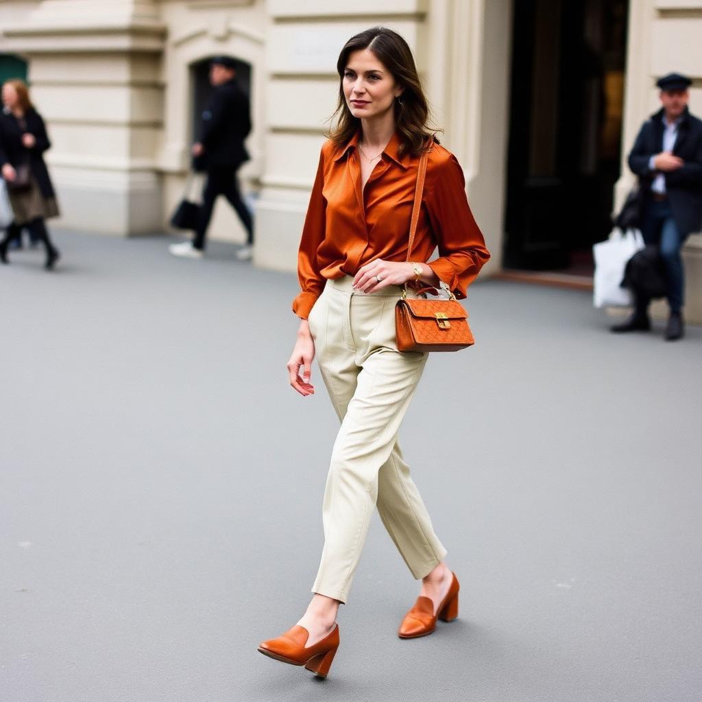
Practical Styling Tips You Can Use This Week
The theory is only useful if you can wear it on a Wednesday. A short, practical list to keep in mind the next time you stand in front of your wardrobe:
- Start with the piece you love most and build the palette around it. A single burgundy skirt or an olive coat is a colour brief; work outward from there.
- Limit yourself to two dominant colours per outfit, with a neutral supporting cast. Three colours is a lookbook challenge; two is a wardrobe.
- Match undertones, not shades. Warm goes with warm; cool goes with cool. A warm ivory next to a cool stark white will always fight; a warm ivory next to a cognac loafer will sing.
- Repeat one colour in your accessories. If your shoe is cognac, echo it in the bag, belt or earring. It is the fastest way to look considered.
- Choose the fabric with more care than the colour. Silk, wool, cashmere, linen, and leather flatter every palette. Cheap synthetics flatten every palette.
- When in doubt, monochromatic. A single colour in three textures is nearly impossible to get wrong.
- Invest in the anchor pieces — a structured blazer, a pair of tailored trousers, a silk skirt, a pair of loafers, a minimalist heel, a leather handbag, a piece of gold jewellery. Colour lives easily on top of a foundation like this.
- Save what you love, wear what suits you. Pinterest inspiration is only useful if it survives the walk from the mirror to the door.
Colour is one of the last true frontiers of personal style. Once tailoring is understood, once fabric is understood, once the basics of proportion have been quietly absorbed, colour is where taste distinguishes itself. It is the thing that turns a well-made outfit into something the room remembers.
The women who wear it most convincingly are not chasing trends. They have found a palette that flatters them — perhaps burgundy and chocolate, perhaps olive and cream, perhaps a lifetime of thoughtful monochromes — and they return to it season after season, refining rather than reinventing. That is what taste looks like in practice: a small, edited vocabulary, worn well.
Expensive style, in the end, is not a matter of budget. It is a matter of harmony — of colours in conversation, of textures that answer each other, of tailoring that respects the body. Wear the colours that make you feel most yourself. Build the wardrobe slowly. And trust that the most sophisticated outfit in the room is almost always the quietest.
Disclosure · The selections below were independently chosen by our editors. Some links are affiliate; we may earn a small commission when you shop through them.
Curated · Tested · Recommended
Suggested to Shop
The pieces mentioned in this story, in one place — independently chosen by our editors.
Some links are affiliate. We may earn a commission at no cost to you.